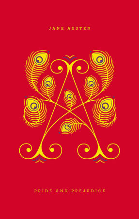
From A to Z, the Penguin Drop Caps series collects 26 unique hardcovers—featuring cover art by type superstar Jessica Hische It all begins with a letter. Fall in love with Penguin Drop Caps, a new series of twenty-six collectible and gift-worthy hardcover editions, each with a type cover showcasing a gorgeously illustrated letter of the alphabet by superstar type designer Jessica Hische, whose work has appeared everywhere from Tiffany & Co. to Wes Anderson's film
Moonrise Kingdom to Penguin's own bestsellers
Committed and
Rules of Civility. A collaboration between Jessica Hische and Penguin Art Director Paul Buckley, the series design encompasses foil-stamped paper-over-board cases in a rainbow-hued spectrum across all twenty-six book spines and a decorative stain on all three paper edges. Penguin Drop Caps debuts with an “A” for Jane Austen’s
Pride and Prejudice, a “B” for Charlotte Brontë’s
Jane Eyre, and a “C” for Willa Cather’s
My Ántonia, and continues with more classics from Penguin.
A is for Austen. Few have failed to be charmed by the witty and independent spirit of Elizabeth Bennet in Austen’s beloved classic
Pride and Prejudice. Elizabeth’s early determination to dislike Mr. Darcy is a prejudice only matched by the folly of his arrogant pride. Their first impressions give way to true feelings in a comedy profoundly concerned with happiness and how it might be achieved.
On sale: December 12, 2012
Page count: 416 Pages
ISBN: 9780143123163
Jane Austen was born on December 16, 1775, in Steventon, a small village in Hampshire, England. As a girl, she wrote stories, including burlesques of popular romances. She lived with her family in Steventon until her father, a clergyman in the Church of England, retired in 1801. After his death, in 1805, she, her mother, and her sister did not have a settled home until 1809, when they moved to Chawton, Hampshire. There she was extraordinarily productive, revising three novels and writing three more from scratch. Published during her lifetime were
Sense and Sensibility (1811),
Pride and Prejudice (1813),
Mansfield Park (1814), and
Emma (1815). Austen died on July 18, 1817, in Winchester, where she was receiving medical treatment, and was buried in that city’s cathedral. Two more novels,
Northanger Abbey and
Persuasion, were published posthumously in 1817 with a biographical notice by her brother Henry Austen, the first formal announcement of her authorship. She also left two earlier compositions: a short epistolary novel,
Lady Susan, and an unfinished novel,
The Watsons. At the time of her death, she was working on a new novel,
Sanditon, a fragmentary draft of which survives.
Jessica Hische is a letterer, an illustrator, a typographer, and a web designer. She currently serves on the Type Directors Club board of directors, has been named a
Forbes magazine “30 under 30” in art and design. She lives in San Francisco, California, and Brooklyn, New York.
Winner of the 2012 Fifty Books/Fifty Covers show, organized by Design Observer in association with AIGA and Designers & Books
Winner of the 2014 Type Directors Club Communication Design Award
Praise for Penguin Drop Caps:"[Penguin Drop Caps] convey a sense of nostalgia for the tactility and aesthetic power of a physical book and for a centuries-old tradition of beautiful lettering."
—
Fast Company“Vibrant, minimalist new typographic covers…. Bonus points for the heartening gender balance of the initial selections.”
—Maria Popova,
Brain Pickings"The Penguin Drop Caps series is a great example of the power of design. Why buy these particular classics when there are less expensive, even free editions of
Great Expectations? Because they’re beautiful objects. Paul Buckley and Jessica Hische’s fresh approach to the literary classics reduces the design down to typography and color. Each cover is foil-stamped with a cleverly illustrated letterform that reveals an element of the story. Jane Austen’s A (
Pride and Prejudice) is formed by opulent peacock feathers and Charlotte Bronte’s B (
Jane Eyre) is surrounded by flames. The complete set forms a rainbow spectrum prettier than anything else on your bookshelf."
—Rex Bonomelli,
The New York Times"Drool-inducing."
—
Flavorwire"Classic reads in stunning covers—your book club will be dying."
—
Redbook